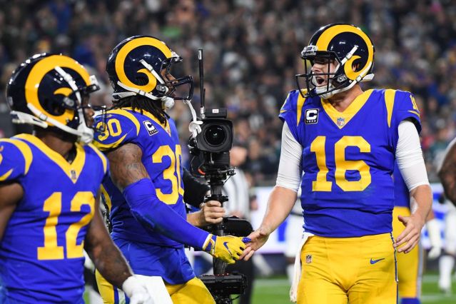
The royal blue with the golden yellow and the spiral ram horn on the helmet? Iconic. The Rams had one of the sharpest, simplistic logos in sports and they dumped it in favor of this??
So this #Rams new logo hat that leaked on Reddit is legitimate. That’s the new logo. Thoughts? pic.twitter.com/mTZMeseS2f
— Charles Robinson (@CharlesRobinson) March 8, 2020
That is some expansion team type design right here. This looks like an NFL Draft hat or one of those alternate spring training caps that MLB tries to sell you every spring.
I remember reading that one of the reasons the Patriots went away from Pat the Patriot in favor of the Flying Elvis was because of simplicity. Pat the Patriot was just kind of a bitch to put on everything and still have it look accurate. It was just too complicated of a logo to put on helmets, shirts, pins, pens, etc. So the Rams took one of the simplest designs in all of sports and axed it just because. Why go away from that? I understand they wanted to freshen things up as they go into a new stadium, but this is a Chargers move not a Rams move.
The new Rams logo looks like it’s from a tv show about pro football and they didn’t have rights from the NFL pic.twitter.com/NXL6uf0Y6X
— Eric Stangel (@EricStangel) March 8, 2020
Categories: NFL
