NBA tweaks league logo: https://t.co/9rW51Bju3T pic.twitter.com/13YUy7UTxB
— Paul Lukas (@UniWatch) July 7, 2017
I need to reevaluate my career goals and get into graphic design. Whatever the NBA paid some marketing firm to “refresh” and “modernize” its logo was way, way too much.
Seriously, I could’ve done that. I’d haven been happy to do it for no more than $20,000. I have Microsoft Office. I could’ve clicked through every font and made the decision that Arial Narrow worked better than regular old Arial. I would have lobbied hard for Franklin Gothic Medium, but I don’t know that the NBA would have gone for it.
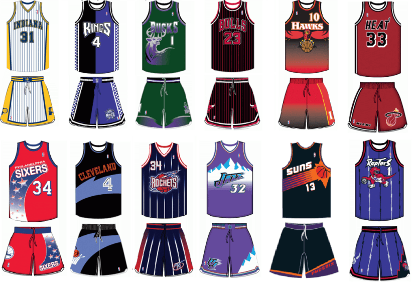
But maybe I should be giving the NBA more credit for showing some restraint. The 1990s were great, but featured some garish NBA uniforms.
And then there was the Detroit Pistons logo, which is the New Coke of NBA redesigns.

If you want more information on the NBA’s updated logo, a press release describing the new “taller, leaner typeface” can be found on their website. I bet writing the press release was harder than actually updating the logo. Gotta own the story I guess.