Tag: Players Weekend

Introducing the MLB Players Weekend Hats AKA Straight Acid Trip Apparel

To go along with Players Weekend and the nicknames jerseys, MLB is also rolling out some new wacky hats to match. This is some straight up acid trip apparel that I am unfamiliar with. Are the managers going to be required to wear Kramer’s technicolor dreamcoat?

But seriously, these are some wacky color combos. I’m 100% a jaded man and see this is a blatant marketing cash grab, disguised as a fun, quirky gimmick to show how fun baseball is. Now unsurprisingly you’ve got your usual suspects of teams that did the bare minimum like the Yankees, the Giants, and the Angels.

The Giants and the Angels basically just rolled out their normal hats. Good job, good effort guys.

Then you’ve got teams who said, “Acid? Why not make it 2 tabs, lets fucking go!”

Now theres actually a few pretty sharp hats in here too that take advantage of the wild color schemes and use it to create something fun and eye catching:

This is a choice hat by the Rockies going with their secondary logo, that is a great goddamn hat.

Doesn’t matter if you’re the worst team in baseball if you look slick in a new cap and the Liberty Bell logo here does that as both bold yet minimalist.

Really solid hat here for Minnesota, combining the state outline with the Twin Cities logo.

Unfortunately the Red Sox were not one of those teams, which hurts to say coming from a HUGE hat guy like myself. The Sox Players Weekend hat is a decidedly mediocre “meh.”

The other contenders for “hats I would potentially buy.”

You can never go wrong with a sexy throwback A’s hat. Pair this with a bushy mustache and a YUCK t-shirt to go full Dennis Eckersley and David Price legitimately may fight you on Yawkey Way.

Pirates usually have some pretty solid caps as I am the proud owner of the throwback striped pillbox hat.

This is a solid effort from the Pirates for Players Weekend, probably could’ve used a black brim though to even things out a bit.

Despite the fact I just deducted points from Pittsburgh for going too yellow, the Rays embrace it with the still ridiculous sunburst logo to make an exceptionally loud hat.

Now THAT is how you break down the apparel of professional sports teams. Your move, Uni Watch.


The Yankees Have Succumb to Names on Jerseys for Players Weekend and it Makes Me Laugh

For years the Yankees and their fans have had a smug sense of entitlement because they all sport a Boys Regular haircut, shave their beards, and most importantly don’t have names on the backs of their jerseys. Well that and the obscene number of WS trophies. But, hey its the Yankees, you should know who the players are without any names on the jerseys.

Welp, throw that shit right out the window because later this month, just like the rest of us common folk, the Yankees players will be wearing jerseys at home with players names on the back for the FIRST TIME SINCE 1915.

And its not just any jersey its the ridiculous cash-grab of a marketing scheme jerseys with not only players’ names on the back, but WACKY nicknames to boot. Names like “All Rise,” “Red Thunder,” and “All Staarlin” will desecrate the sacred confines of Yankee Stadium. Welcome to the poor house with the rest of us, Yankees fans.

PS – Shoutout to Brett Gardner for saying ya know what fuck this, just put my name on the back. Respect that hate.

The Players Weekend Uniforms Are Here

Major League Baseball’s first Players Weekend will take place August 25 through August 27, and the special uniforms and nicknames that will be used that weekend were released on Wednesday. They are… interesting.

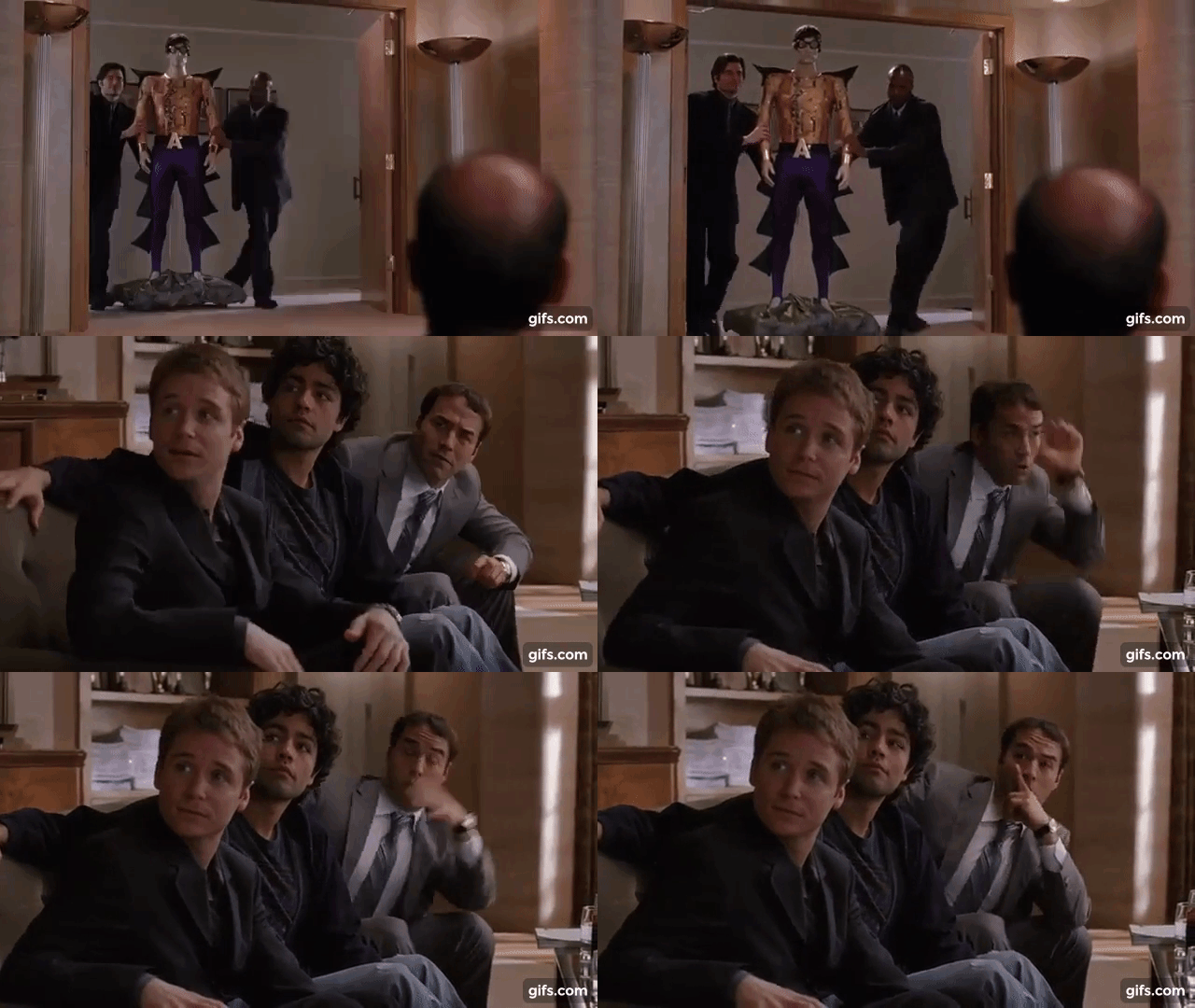
aquaman.gif

I’ve got no issue with the nicknames. Some nicknames [2-Bags] are better than others [Astro’s Dad], but that’s to be expected. No word on whether or not the managers will be wearing nicknames but it is Players Weekendβ„’, so I say let the players pick manager nicknames, too. I’d love to see John Farrell in full FML mode wearing a “Manager John” jersey.

giphy.gif

The uniforms, though, are surprising at best and outlandish at worst. I love a good pullover jersey, but contrast color sleeves on a pullover jersey look way out of place.

The colors of the Red Sox jersey aren’t much of a departure from their traditional color scheme, but some of these jerseys are truly hideous. I think the Astros, Rays and Brewers jerseys fall into that category pretty safely.


When I first saw these jerseys I thought they looked like cheap fashion jerseys from T.J. Maxx. Unfortunately, that might be the point.

I’d prefer to see nicknames on real jerseys, but if you already have a #15 Red Sox jersey will you buy a new one that says “Laser Show” on the back? Or would you be more likely to buy a new, “special edition” jersey with “Laser Show” on the back? It’s all about hawking merchandise, and MLB is betting the latter.