Finally, a bright spot this offseason for Celtics fans. For the record, I did keep my Toine jersey and I do look forward to being able to rock a current jersey next season for $free.99.
I knew when I dropped $20 on this XL jersey in 2005 after the Celtics said goodbye to Walker for a second time that it would be worth it. Fourteen years later, it looks like I will be making quite a return on my investment! Another reason to appreciate the C’s sticking with their classic look. And it just goes to show that everything eventually comes back into style.
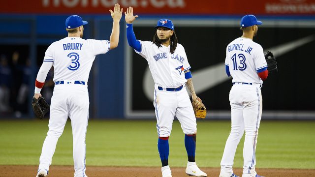
For other examples of “throwbacks” coming back into style, see the Toronto Blue Jays:
Utah Jazz:
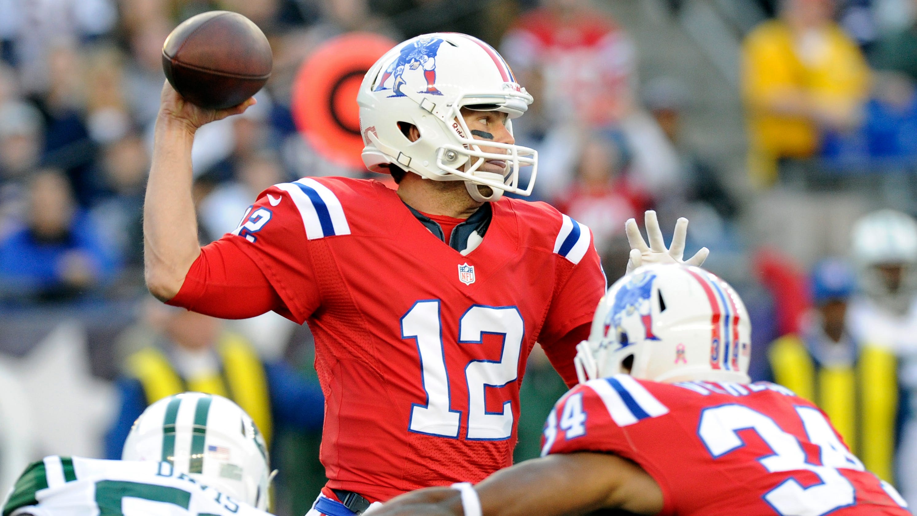
And your New England Patriots:
Now excuse me while I put my #15 Red Sox jersey at the back of the rotation as I wait for the next franchise player to claim that number.
NBA City Edition uniforms are a mixed bag. Some, like the Timberwolves uniform, are great. Others, like the Suns uniform, suck. They all feel like an obscene cash grab. Still, this Celtics uniform is damn near perfect.
It can be easy for Nike to get a little too creative and make these uniforms too busy and look like costumes. Last year’s gray Celtics uniform is a good example. Others feel a bit dull. This year’s Celtics City Edition uniform strikes a perfect balance.
The Celtics can’t really wear throwback uniforms because they’ve basically worn the same uniforms for 70 years. They’re the Yankees of the NBA, in more ways than one. This uniform feels like a throwback, though, when compared to the Celtics’ old warmup jackets:
Some people might call these Celtics uniforms dull, but the introduction of a third color for them is huge. The yellow is a nice touch, much better than going the easy route and just adding in more black. I would have preferred Celtics on the front instead of Boston, but I guess they are “City Edition” uniforms.
The Celtics will wear these uniforms 11 times this season. And of course, they’re on sale now.
On Thursday we discussed the Minnesota Timberwolves Prince-inspired city edition uniform. It’s clear that considerable thought and effort were put into the design of that uniform. The result is a fresh look, and a clean finished product that includes just enough nods to the Minneapolis legend. It’s also clear that the Timberwolves are carefully crafting Prince theme nights for when they break out their city edition jerseys.
On the other end of the city edition spectrum is the Phoenix Suns city edition uniform. They could’ve just trotted out the Charles Barkley era uniform and every millennial sports fan would have raved about how great the Suns city edition uniform was.
Instead, the Suns city edition uniform looks like a middle school Spanish project that was hastily completed 12 hours before it was due.
I understand that they are going with “Los Suns” to pay homage to the Hispanic heritage of their community, but they couldn’t do better than just adding the Spanish word for “the” to their jerseys? The Milwaukee Brewers do heritage jerseys the best. When they hosted Cerveceros Day this past summer to honor the heritage and importance of Latin American culture to baseball, they wore jerseys that said Cerveceros. Cerveceros is literally brewer in Spanish.
Why couldn’t the Suns go with “Soles?” They do realize these jerseys literally have the word “LOSS” on the front of them, right?
ESPN – When Prince died in April 2016, Nike pitched the Wolves an alternate “city edition” jersey for the 2017-18 season that would honor him. The Wolves concluded it was too soon. They were already finalizing their 2017-18 jerseys, which would kick off a full-on rebrand — new jerseys, new logo, new court, tweaked color scheme.
But they decided then to prioritize a Prince jersey for this season. They set aside some of Nike’s other proposed Minnesota-centric motifs: jerseys paying homage to Bob Dylan, the Mississippi River (which runs through Minneapolis), and the original Minneapolis Lakers, Johnson says. (You might see some of those ideas down the road.)
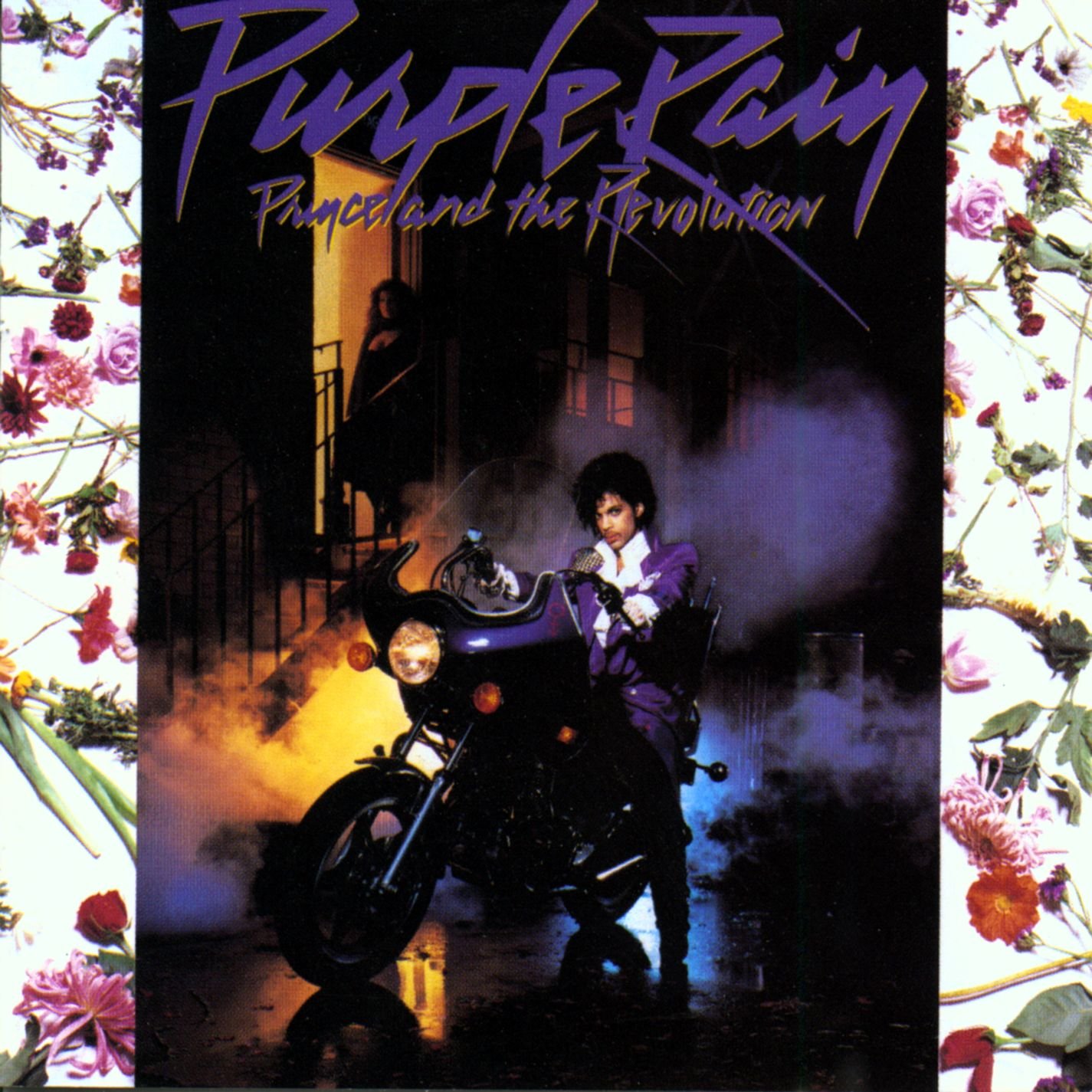
In case you haven’t heard, Prince is a big deal in Minnesota. A really big deal. When I lived in Boston, I hardly ever heard Prince on the radio. Living in Minneapolis, though, I can’t go a day without hearing him on the radio. And that’s not a bad thing. As I wrote on Prince Day last year, I was wrong about Prince. Prince is definitely an acquired taste, but he had an incredible list of hits and I wish I had paid more attention to him and his work while he was alive. He was an incredible musician and performer.
It can be nauseating to see some of the half-assed Prince promotions the teams in Minnesota run. Giving out purple hats and playing Purple Rain during the 7th inning stretch is the definition of a half-assed promotion. Thankfully, it looks like the Timberwolves are going above and beyond.
First, they made the right choice of which direction to go in for their city edition jersey. Minneapolis Lakers inspired jerseys? Really? Can you imagine the Baltimore Ravens wearing Baltimore Colts throwbacks? There’d be a revolt in the stands, and understandably so. Second, the jersey itself looks very well done.
And third, the Timberwolves will do much, much more than most teams to actually make their Prince nights a special experience. From Zach Lowe on ESPN:
The Wolves will wear the jerseys eight times this season, five at home. The in-arena trappings at those home games — giveaway shirts, signage, lighting — will turn purple. Tom Thibodeau, the team’s coach and general manager, even let team officials take the players for a separate day of shooting to prepare a special Prince- and purple-themed pregame video that will run on the scoreboard — not a small concession if you know Thibodeau. The team thought about producing a purple court, but opted against it, officials say.
As yet unannounced halftime performers will pay tribute to Prince, and the broader Minneapolis music scene, team officials say. The team will present donations to some of Prince’s favorite charities.
The Timberwolves Twitter feed offers a good look at the special photo day Lowe mentions:
Also, it’s nice to see some restraint from a Nike production like this. No clutter on the jersey and a wise move to skip the purple court. Overall, this looks to be some A+ promotional work from a team that could use some good press. Maybe now the classic rock stations in Minnesota can stop cutting out the best part of Purple Rain on the radio.
Major League Baseball’s first Players Weekend will take place August 25 through August 27, and the special uniforms and nicknames that will be used that weekend were released on Wednesday. They are… interesting.
I’ve got no issue with the nicknames. Some nicknames [2-Bags] are better than others [Astro’s Dad], but that’s to be expected. No word on whether or not the managers will be wearing nicknames but it is Players Weekend™, so I say let the players pick manager nicknames, too. I’d love to see John Farrell in full FML mode wearing a “Manager John” jersey.
The uniforms, though, are surprising at best and outlandish at worst. I love a good pullover jersey, but contrast color sleeves on a pullover jersey look way out of place.
The colors of the Red Sox jersey aren’t much of a departure from their traditional color scheme, but some of these jerseys are truly hideous. I think the Astros, Rays and Brewers jerseys fall into that category pretty safely.
Here’s a look at all the cap and jersey combinations for Players Weekend.
When I first saw these jerseys I thought they looked like cheap fashion jerseys from T.J. Maxx. Unfortunately, that might be the point.
I’d prefer to see nicknames on real jerseys, but if you already have a #15 Red Sox jersey will you buy a new one that says “Laser Show” on the back? Or would you be more likely to buy a new, “special edition” jersey with “Laser Show” on the back? It’s all about hawking merchandise, and MLB is betting the latter.
ESPN Uni Watch – If you’ve ever looked at the rainbow uni and wondered who dreamed it up, the answer is the advertising firm McCann Erickson, which was hired by the Astros to redesign the team’s look for the 1975 season.
It would be fascinating to see the company’s original files and to know the identities of the people who worked on the project, right? The good news in that regard is that McCann Erickson still exists (it’s now known simply as McCann). The bad news is that a company spokesman said the firm no longer has any original sketches or other archival paperwork. The Astros haven’t saved any original documents, either. Sigh.
I can imagine the Don Draper pitch to the Houston Astros…
In your first 13 seasons you’ve never reached the playoffs, never won more than 84 games in a season, and never finished higher than third place. Now, you’re not even the only game in town. You’ve got to deal with the Texas Rangers in Arlington siphoning fans away from you. It’s time to change the conversation.
The Astros play in the state-of-the-art Astrodome. The Eighth Wonder of the World. Isn’t it time for the Astros to wear uniforms as ground breaking as their stadium? I give you the uniform of the future.
Baseball has never seen anything like this, and neither have your fans. People will flock to the Astrodome just to get a glimpse of these uniforms. They will get people talking. They will get people to forget whether or not you’re in the pennant race. And most importantly, these uniforms will get people to forget about your rivals in North Texas.
They said the Yankees never used to lose because the other teams were too busy staring at the pinstripes. Imagine playing the Astros, and staring at these.
BUY BUY BUY!
This uniform is audacious even by today’s standards. I’d love to have seen the reaction of the Old Time Baseball Guys when they got this pitch from McCann Erickson in 1975. But it has aged quite well and is almost universally revered to this day. It has to be the most popular throwback out there. Some looks are dated and stale, but this look is still fresh.
The Astros took a step in the right direction the last time they updated their uniforms in 2013. Hopefully the next time they make a change it’s a little bit further in this direction.


 Instead, the Suns city edition uniform looks like a middle school Spanish project that was hastily completed 12 hours before it was due.


 ESPN Uni Watch
